Time Series Visualizations
Fire Insights provides a number of Processors for the visualization of the time series data.
| Charts | Description |
|---|---|
| Line | Perfect for series of data points to form a continuous line. Example - Represent Daily sales data. |
| Bar | Bar charts are a fundamental visualization for comparing values between groups of data. Best way to represent Categorical data. |
| Scatter | Scatter plots are used to observe relationships between variables. |
| Histogram | Histograms are a type of graph that shows the distribution of a dataset. They graph the percentage or the number of instances of different categories. |
| Pie | Illustrate the percentage breakdown of a small number of data points, then they can be very effective. |
Charts : LineChart
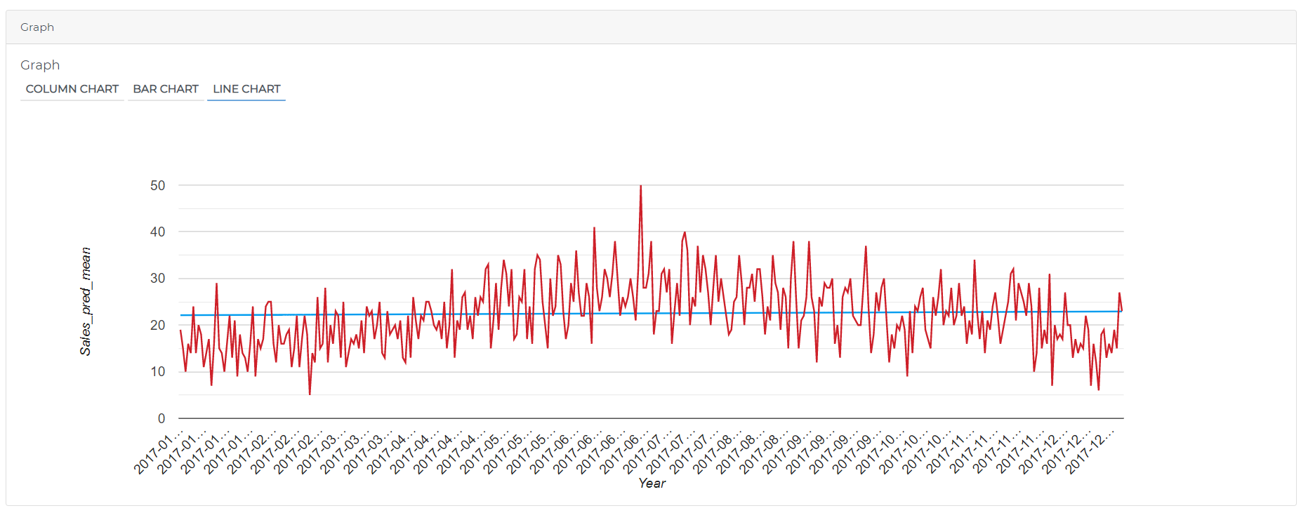
Perfect for series of data points to form a continuous line. Example - Represent Daily sales data
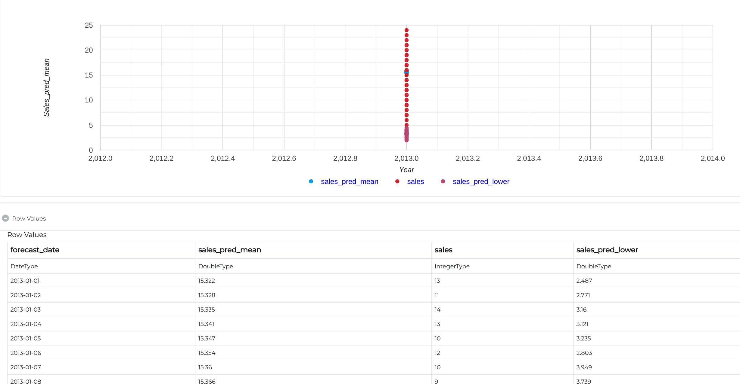
Below is the sample workflows which contains Time Series data and visualize using line chart in Fire Insights.
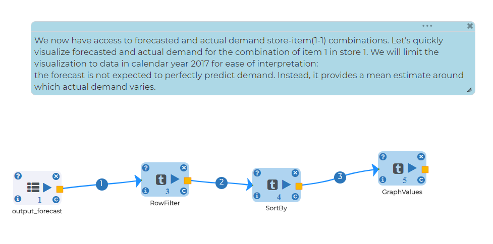
Configurations for visualization processors in Fire Insight: * Set number of columns want to represent on y axis with respect to x axis * Set chart type based on data type
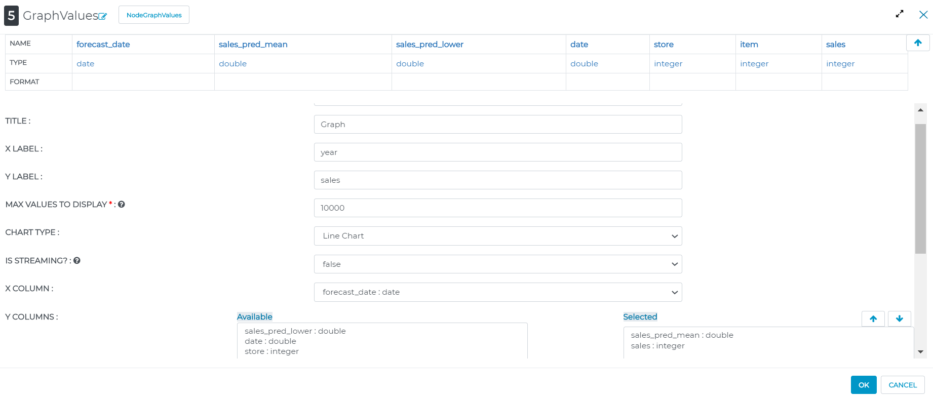
Output result of Visualization processor:
Charts : BarChart

Charts : Scatter